 Khaled Hashem
Restructuring and repositioning of a handmade accessories store - Rawnak
I care about your comfort... For a better reading experience, please view this on a larger screen.
The Client & The Challenge
A bespoke handmade resin accessories brand managed entirely by a solopreneur handling production, marketing, and client relations. Despite being active for over five years, the brand lacked a structured business model or marketing foundation, leading to stagnant growth and a heavy reliance on local, offline sales.
Stagnant growth with total 5-year revenue under 4,000 SAR. The brand suffered from a lack of clear positioning, seasonal dependency (bazaars), amateur visual presentation that diminished product value, and pricing that failed to cover manual labor.
Research & Discovery
Identity Gap
The old name (Pink Bara) created communication confusion; rebranded to 'Rawnak' to evoke elegance and organic premium quality.
Visual Overhaul
Amateur photography hid the product's premium finish; established studio-level visual guidelines to highlight gloss and clarity.
Pricing Framework
Arbitrary pricing led to hidden losses; structured a value-based model that accounts for materials, shipping, and craft hours.
Target Segmentation
Segmented the market into self-purchasing fashion enthusiasts and the highly profitable personalized gifting niche.
Pre-Intervention Baseline
A comprehensive audit of the brand's historical performance revealed a fundamental truth: the challenge was never about product quality or craftsmanship — it was about the total absence of a strategic, positioned business and marketing model. A shop operating for five years with total revenue under 4,000 SAR — averaging less than 67 SAR per month — suffered from structural stagnation that no surface-level fix could resolve.
Root-Cause Audit & Prioritized Diagnosis
- Critical Brand Name Misalignment & Identity Gap: The old name — "Pink Bara" (English + Japanese) — was adopted without market context. It created consumer confusion, failed to evoke premium craft value, and alienated the target local demographic.
- Critical Complete Lack of Visual Standards: Amateur, poorly lit mobile photography completely obscured the transparent clarity and brilliant gloss of the resin, hiding the delicate botanicals and gold flakes within each piece.
- High Undefined Target Audience & Missing Funnel: "Spray-and-pray" marketing with no defined user profiles, no behavioral mapping, and no customer touchpoints to guide prospective buyers toward conversion.
- High Brand Dilution & Premature Scaling: A secondary social channel for anime merchandise was launched before establishing a strong anchor around the core premium offerings, dividing extremely limited resources.
- High Arbitrary Cost Modeling & Blind Pricing: Prices set purely by guesswork, overlooking micro-material costs, wastage rates, shipping overheads, and most critically — the artisan's manual labor hours — resulting in consistent hidden operating losses.
- Medium Polluted Operational Feedback: Over 90% of historical transactions came from friends and family, creating a biased feedback loop that made it impossible to read genuine market demand.
Strategic Diagnosis: Stagnant revenue was not a product quality problem — it was the direct consequence of running the project as an unpositioned "personal hobby" devoid of identity, customer experience design, and professional cost modeling.
Strategic Repositioning — adopting the Rawnak brand
We anchored every design and strategic decision on a single question: What is the precise emotional response a consumer should experience during their very first second of exposure to this brand?
The Old Name
Pink Bara — A confusing mix of English and Japanese meaning "pink rose." It alienated the local demographic, carried zero premium associations, and failed to communicate the handmade craft value.
The New Name
Rawnak (رونق) — An elegant Arabic word meaning radiance, grace, and exquisite splendor. "When you buy from Rawnak, you obtain your own unique radiance." Elegant, warm, and structurally memorable.
Positioning Philosophy: Carving out the profitable middle ground between cheap mass-market resin novelties and hyper-expensive designer jewelry — positioned as "Affordable Luxury" with exceptional craftsmanship and high-end presentation at an accessible premium price point.
The Visual Color System
A cohesive color palette representing quiet elegance and organic botanical art:
Logo Evolution & Brand Archetype
We stripped the heavy, literal rose icon from the old logo and adopted clean, modern typographical identity — embracing "Less is More." Authentic luxury speaks through clean lines and balanced typography.
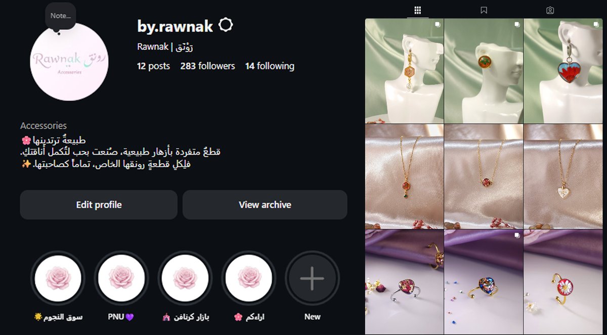
Studio-level photography guidelines were established focusing on warm, natural light and neutral, minimalist backdrops to highlight the high-fidelity gloss, light reflection, and internal detail of every resin piece.
Logo Evolution Timeline
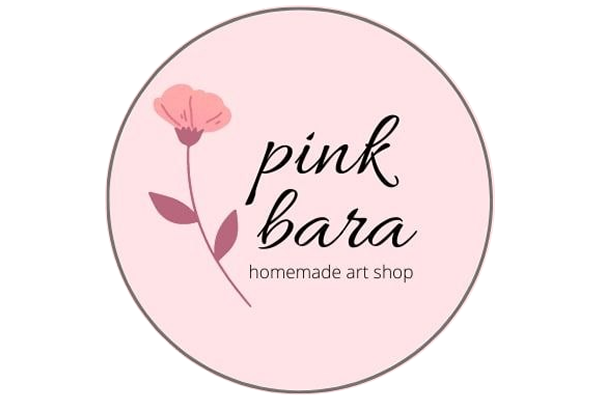 Before
 Evolution 1
 Final Logo
Consumer Behavior & Target Segmentation
To eliminate broad, wasteful targeting, the market was segmented into two distinct buyer profiles with unique purchasing drivers:
Primary Segment — Aesthetic Self-Indulgence (B2C)
Demographics: Females aged 18–35 in Saudi Arabia, middle-to-high income brackets (students, professionals, creative freelancers).
Drivers: Passionate about niche fashion and alternative art. They seek unique, personalized statement accessories that reflect their inner identity, strongly preferring handmade crafts over mass-produced jewelry.
Secondary Segment — Premium Commemorative Gifting
Demographics: Males and females aged 20–40, seeking high-value customized gifts for milestones and special occasions.
Drivers: Flexible budget (100–350 SAR). They place massive value on personalization, premium unboxing, and the emotional weight of a bespoke gift. A highly profitable segment frequently overlooked by handmade craft businesses.
Customer Persona Profile
Attributes: Reflective, serene personality with deep appreciation for architectural balance. Embraces strict minimalist aesthetics; loves botanical art and nature.
Pain Points: Frustrated by cheap, plastic accessories that look mass-produced. Struggles to find curated, organic statement pieces. Searches for a genuine human story behind her purchases.
Purchasing Behavior: A slow, deliberate shopper who values premium packaging, reads shipping policies, and has a flexible budget for authentic, one-of-a-kind art.
Value Proposition: "A rare fragment of nature, preserved forever — bespoke resin accessories with real botanical elements, customized to mirror your unique radiance."
Competitor Mapping & Golden Market Gap
An extensive competitive analysis of 9 active brands in the Saudi market (6 direct, 3 indirect):
| Classification | Market Profile | Key Strengths | Identified Weaknesses | Threat Level |
|---|---|---|---|---|
| Premium Class | Established boutique resin brands | Strong visual credibility; pre-built community | Extreme product dilution (Paradox of Choice) | Direct competition |
| Mass Market | Trendy, high-turnover craft shops | Rapid trend adaptation; low prices | Amateur presentation; unstable branding | Low threat |
| Rawnak | Affordable Luxury space | Cohesive identity; elite curation; bundled gifts | Small initial scale | — |
The Golden Opportunity: Positioning directly in the open middle ground — offering high-end aesthetics, impeccable quality, and a curated selection. Premium Gift Bundles drive up AOV while solving choice paralysis.
Concierge-Style Digital Customer Journey
With an automated e-commerce store deferred to protect cash reserves, we designed a high-touch "VIP Concierge-Style Journey" that turned technical limitation into a premium brand advantage:
Cinematic, visually satisfying Reels showcasing satisfy-pouring, custom flower placements, and demolding clips, supported by organic word-of-mouth.
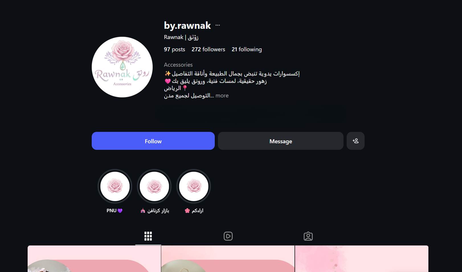
An immaculate grid layout with detailed Highlights explaining ordering blueprint, customization menus, crafting timelines, and operational policies.
Direct-message or WhatsApp Business flow to discuss bespoke specs. Conversion secured via advance deposit, turning a simple transaction into a personalized boutique service.
Custom premium packaging ensuring a high-end tactile unboxing experience, with reliable tracked domestic shipping.
Minimalist loyalty card enclosed in the box (5 orders = exclusive bespoke item free), with structured UGC incentives for social sharing.
CX Insight: Technical non-automation was refactored into a high-end commercial strength. Instead of a sterile shopping cart, customers receive custom design consultations directly from the artist.
Physical Market Launch & Offline Validation
The rebranding timeline intersected with participation in two high-traffic local bazaars, providing an invaluable sandbox to test the new identity, pricing, and packaging on real consumers.
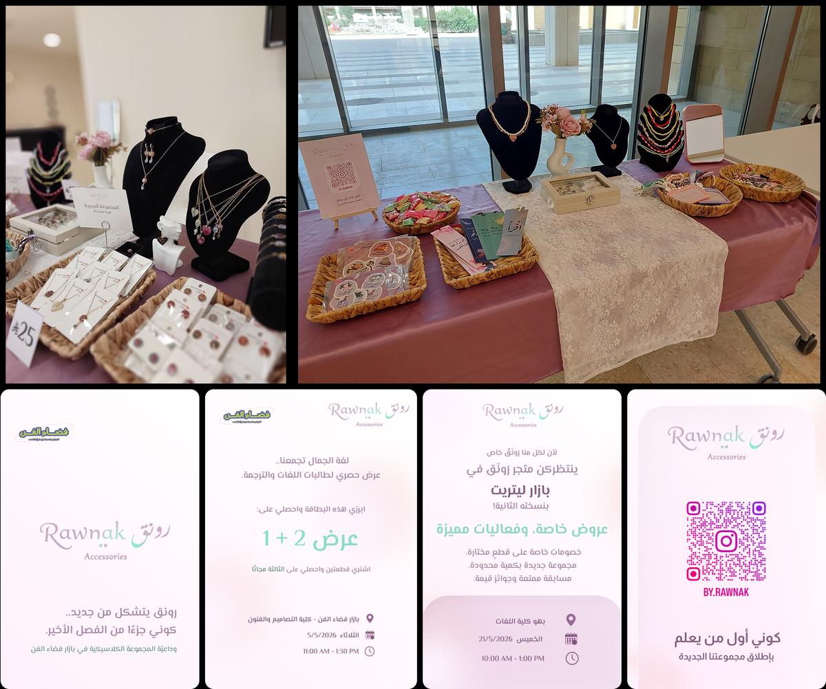
Exhibition space rebuilt with elegant linen, natural wooden stands, and elevated glass cases matching the Rawnak color scheme.
Older stock liquidated at promotional pricing; new premium collection launched at the center of the display to establish the brand's positioning.
Interactive table games and giveaways to increase dwell time, with personalized digital invitations carrying exclusive promotional codes.
First bazaar banned direct sales — pivoted to a pure showroom and lead capture. Second bazaar coincided with university finals, depressing attendance. Despite this, high-quality digital leads were successfully gathered.
Phase 1 Outcomes & Proof of Concept
These results represent the pre-launch validation phase, proving the viability of the brand overhaul prior to any paid advertising campaigns.
Hypothesis Validation Analysis
Validated Hypotheses
- The new premium visual identity successfully evokes feelings of elegance and high value.
- Value-based pricing faces zero friction from the target demographic, validating the shift away from mass-market pricing.
- Organic, satisfying process content acts as a highly effective traffic driver for premium artisanal products.
Variables to Test in Phase 2
- Conversion efficiency and cost-per-acquisition (CPA) with paid targeted traffic.
- Customer Lifetime Value (LTV) and true repeat purchase rate driven by the loyalty program.
- Conversion rate impact when transitioning from the concierge DM model to automated e-commerce.
Phase 2 Expansion & Scaling Roadmap
Converting validated brand foundations into a scalable revenue engine while maintaining premium positioning:
Production of 10 cinematic short-form Reels and 18 high-resolution studio catalog assets to build an elite digital catalog.
A rigorous pricing engine factoring indirect costs (electricity, operational software, marketing labor) and net profit margins for long-term sustainability.
Highly segmented Meta Ads directed at Mona's persona for aesthetic self-purchasing, and seasonal campaigns for the luxury gifting segment.
Fully automated storefront on Salla, triggered exclusively when organic revenues cross the monthly break-even threshold to protect operating capital.
Critique, Evaluation & Strategic Lessons
Strategic Strengths
- Diagnosis-First Execution: Analytical audits and consultative deep-dives corrected structural business issues from day one.
- Low-Cost Physical Validation: Local bazaars as live testing grounds saved thousands in ad spend and yielded unbiased consumer data.
- Cash Reserves Protection: Deferring expensive e-commerce tools until proven demand protected crucial cash flow.
- High-Fidelity Persona: Styling "Mona" from real-world demographics allowed precision content targeting that connected instantly.
Areas for Improvement
- Pricing engine must be consistently updated to include micro-costs (tool wear, packaging prints, marketing hours).
- Competitor tracking must transition from general observation to quantitative Excel monitoring.
- The loyalty program assumption of high repeat purchases needs rigorous Phase 2 measurement.
The Core Takeaway: A premium, handmade product does not need complex marketing miracles to sell. It needs an authentic identity, a meticulously defined audience, and a customer journey crafted with the same love and precision as the product itself. That is the blueprint successfully validated for the future of Rawnak.
Project Gallery